


Advanced Search Comes to Site Builder, Plus New Components
October 8, 2025
It’s a new month which means we’ve made updates to improve Relume. Happy October Release Day!
Here's what's new:
Advanced Component Search
{{TeamMarcKeegan}}
Components are the building blocks of every Relume project, and we know finding the right one can feel like a game of hide-and-seek. That’s why we’re rolling out Advanced Component Search — a smarter way to discover, filter, and preview components directly in the Site Builder. You’ll spend less time searching and more time designing.
How it works
When building in Relume, whether adding or replacing components, you’ll now see a new filter button. Clicking it expands the panel to reveal new controls that help you quickly narrow down and find the perfect component.
- Categories map to all the major component types — like Heroes, Testimonials, and Features, etc.
- Layout lets you refine by structure, alignment and column count.
- Style helps you find components with consistent visual patterns.
- Elements makes it easy to narrow down on specific UI elements.
- And finally, there’s a quick toggle for Uncommon components to surface unique layouts and interactions that can really make your design stand out.
Once you’ve found the perfect component, just insert or swap it into your design — exactly as you do now.
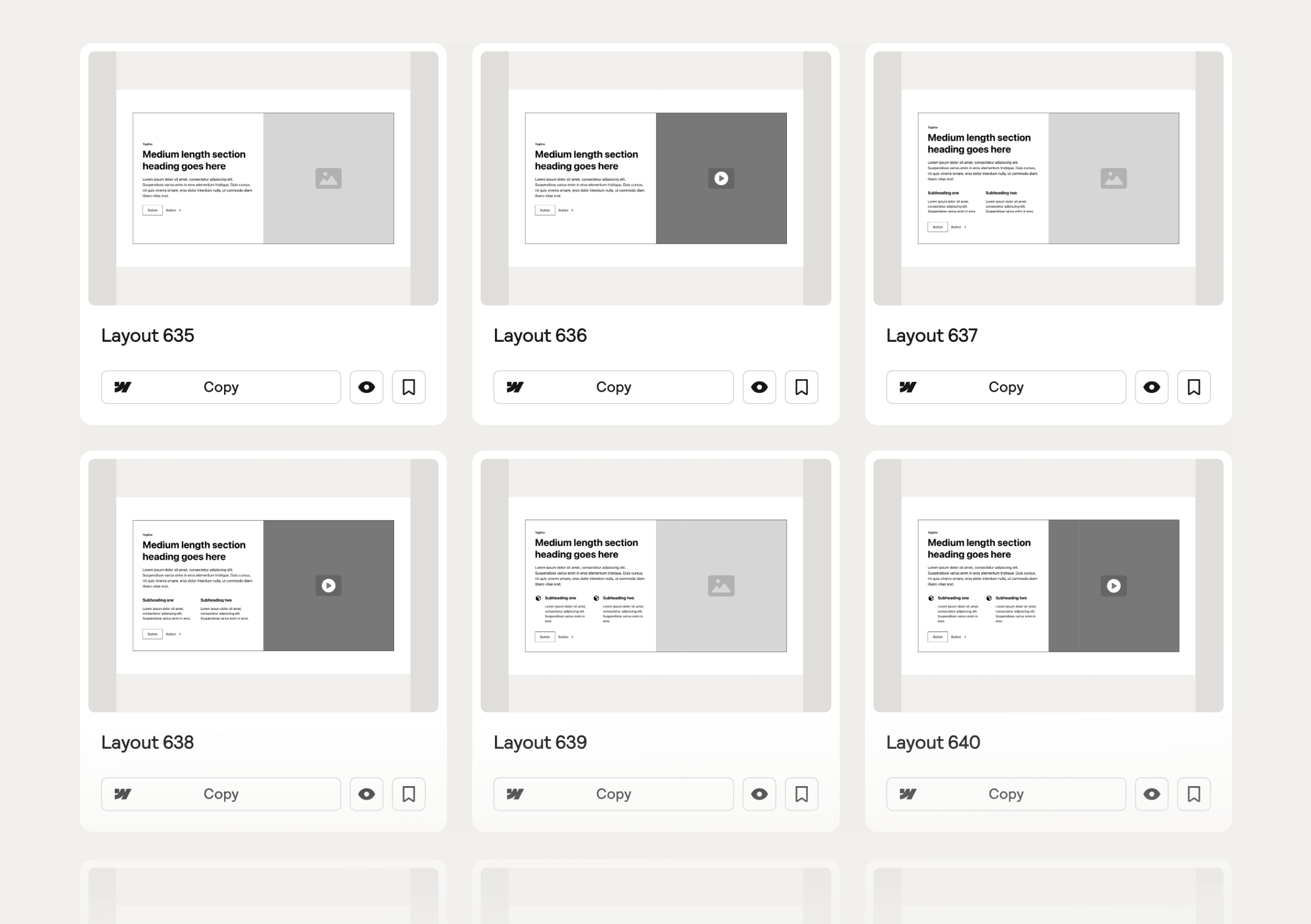
New Components
{{TeamKalebMaria}}
We've just released 75 new components to give you even more flexibility and creative options when designing your next site. This drop includes brand-new Testimonial Sections with videos, background images and cards, and Feature Sections with Cards with cards. Plus, we've squeezed in a few versatile space-filling layouts to round out your builds.
Testimonial Sections
We’ve expanded our testimonial library to help you showcase trust and authenticity in fresh ways.
New variations include:
- Video Testimonial Sections — Bring stories to life with integrated video layouts.
- Background Image Sections — Layer visuals and testimonials for stronger emotional impact.
- Card Layouts — Display multiple testimonials in clean, flexible grids.

Feature Sections with Cards
We’ve expanded our collection of Feature Sections with Cards, giving you even more flexibility to mix and match visual layouts across your builds. You can now use cards across multiple types of feature sections — not just a single layout. This is made possible by the card style variant.
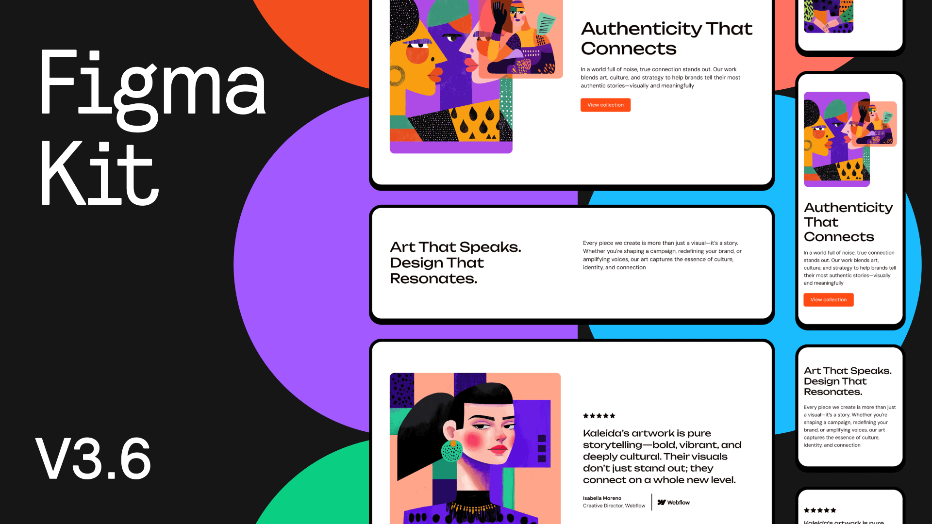
Figma Kit Update v3.6
We have added the 75 new components to our Relume Figma Kit, which is available in both desktop and mobile variants. To receive the latest update, visit the Figma Library in your dashboard.
Figma Plugin Bug Fix
We’ve improved the Relume Figma Plugin to make exporting smoother and more reliable. Previously, when using Figma in the browser, exporting Style Guides and Designs could cause the plugin to freeze or the browser to flag the tab as unresponsive. Now exports complete successfully without interruption. We’ve also updated the loading states to better reflect progress, so you’ll always know how things are progressing.
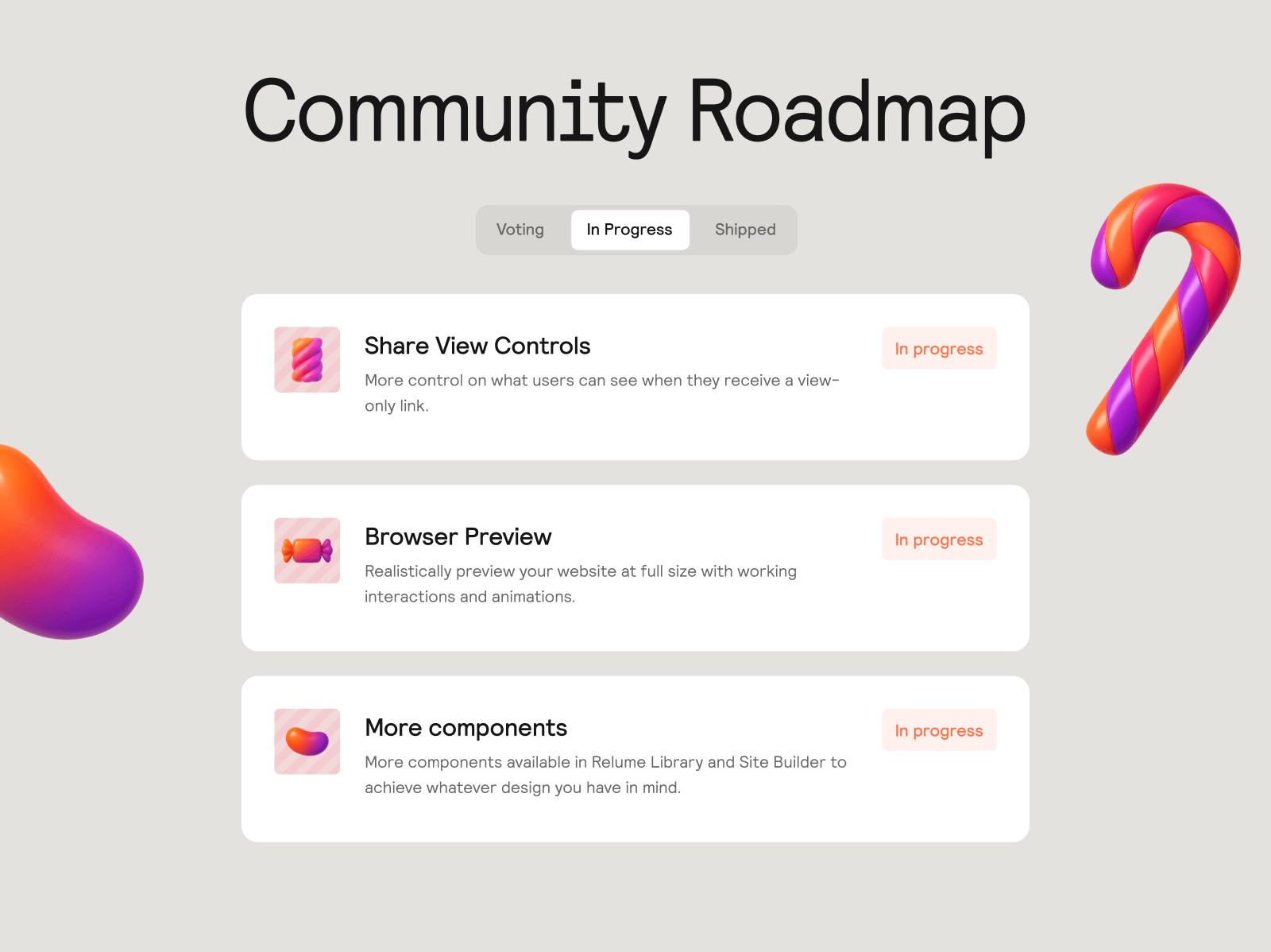
Community Roadmap Update
We've been working on the top-voted item into in-progress which means you can expect to see this drop in upcoming release days.
More variety and creative layouts appear in generations.
Wireframes feel “on-brand” from the first draft.
Sections communicate the right thing with the right structure.
Smoother narrative and fewer repetitive beats down the page.
A more unified site with less rework later.
Less repetition, smoother flow across sections
Sharper, more natural copy.
Saves editing time, closer to production-ready.
Feels like one voice, not stitched-together fragments.


.avif)


.avif)

.avif)

.webp)

.webp)


