

More variety and creative layouts appear in generations.
Wireframes feel “on-brand” from the first draft.
Sections communicate the right thing with the right structure.
Smoother narrative and fewer repetitive beats down the page.
A more unified site with less rework later.
Less repetition, smoother flow across sections
Sharper, more natural copy.
Saves editing time, closer to production-ready.
Feels like one voice, not stitched-together fragments.
Introducing Animated Hero Headers & More
Welcome to the first Component Day since we launched Relume Publish. We've been spending quite a lot of our time building new components and improving the system that every website on Relume is built on, and a lot of what's in this update came directly from the votes and feedback you've shared with us, so thank you.
The idea behind Relume is that AI produces the best websites when it's assembling Lego pieces that humans have designed, tested and QA'd. That means every component should look good no matter what content or settings you throw at it, and realistically you should be able to hand a site over to a client knowing they won't be able to break it. We think this update is a big step in that direction.
If you'd like the full story behind each update, including why we've made some of the decisions we have, the below covers everything. If you'd rather skim, the highlights are below and the full changelog is at the bottom of the page.
Animated hero headers
Relume has always been known for uncommon components, the ones that add that extra memorable moment to a website, so it felt right that the first animated components in the new system would be hero headers, since they're the first thing almost everyone sees when they land on a site.
There are six animation styles to choose from, Media Grows, Media Expands, Media Shrinks, Media Reveals, Sticky Content, or no animation at all, and they work across the Standard, Card and Edge-to-edge hero layouts. You can find them by replacing a hero header, or by using the new Animation variant.
We've built these with CSS animations rather than a library like GSAP, and we did that deliberately. CSS is the most performant option by quite a long way, and we feel like a site that loads and scrolls without any lag is a big part of what makes a website default great. We can achieve almost everything we'd want with it, and every animation works across breakpoints out of the box.
Process sections
Process sections, or how it works sections, are one of the clearest ways to explain what a business actually does, so we've added a new category for them. Your steps can sit in a grid, a slider in two to four columns or a single vertical list, and you can join them with a timeline rail that ends in either a number badge or a simple step dot. There's also a new narrow layout for a centred, single column walkthrough, a larger item size, and a setting to show or hide the media on each step.
The part we're most excited about is how quickly you can move between these. Turning a grid into a timeline is a couple of clicks and your content just maps across, and because AI only needs to adjust properties rather than rebuild the section, it's quite a lot faster and cheaper for AI to get you there too.
Case study sections
Case studies sit somewhere between a blog post and a testimonial, and they work really well when a business wants to talk about the results it's achieved for someone else. We've added eight new sections, with spotlight layouts for showcasing a single customer's outcome and list layouts for showing several, and each case study can include statistics and a link through to its own page.
Items come in three sizes, vertical or horizontal, with a card or standard style, and lists can be a grid or a slider in one to three columns.
Project and portfolio sections
For agencies, studios and freelancers, a portfolio section is often the most important part of the site, so we've added three new sections built for showing off work. Project lists can be a grid, slider, masonry or offset layout in one to three columns, and each project has a name, description and tags. Set a slider to one column and you've got a full width showcase that features one project at a time.
Comparison sections
From a content perspective comparison sections are gold, marketers love them, and they're one of the clearest ways for a business to show why it's the better choice. We've added two new comparison sections where each option gets its own card with its name, details and what's included.
We've also put quite a lot of work into comparison tables, including a grouped table that organises criteria under headings, striped and divided styles, and a criteria column that stays in place while the options scroll on mobile. Responsive tables are realistically one of the hardest things to get right across browsers and breakpoints, so we've done that work so you don't have to think about it.
Small details that make a big difference
Not every update needs a new section to make a difference. These are the system-wide changes that every website on Relume now gets automatically.
Rich text in almost every text field
Most text properties now support rich text, including headings, FAQ questions and answers, testimonial quotes, prices, and team names and roles, so you can add a link or italicise a word right where you're editing.
Content position on backdrop sections
Hero header, page header, feature and CTA sections with a backdrop can now place their content at the top, centre or bottom when the section is set to viewport height. It's a small control, but it gives quite a different feel, and it's really useful when your image has strong subject matter at the top or bottom that you don't want to cover.
Classic portrait and classic landscape
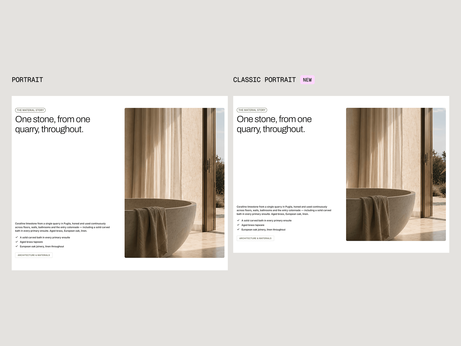
We've added two new aspect ratios, a 4:5 Classic Portrait and its 5:4 Classic Landscape companion. Our original portrait ratio was a little too tall for our liking, and Classic Portrait just feels better across most websites. If you'd rather use the image's own proportions, Auto is still there.
Balanced headings
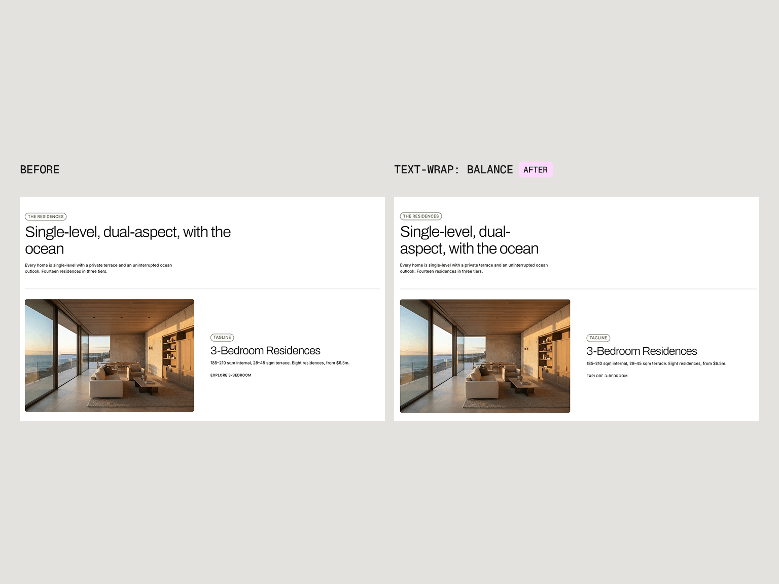
Every heading across the library now uses the CSS property text-wrap: balance, so a multi-line heading splits into even lines instead of leaving one word stranded on its own. You don't need to adjust heading widths at different breakpoints anymore, headings just look right out of the box, and every website on Relume has this built in.
You asked, we shipped
A lot of this update came straight from our community. Animated components were one of the things you asked for most since launch, and balanced headings started as a suggestion from one of you that was such a good idea we rolled it out across the whole system. Please keep the votes and feedback coming, because it genuinely shapes what we build next.
Coming next
CMS is on its way, and the case study and project sections in this update have already been designed with it in mind.
Full changelog
For the web design nerds among us, here's everything that shipped in this update.
New sections
- Animated Hero Headers: six animation styles (Media Grows, Media Expands, Media Shrinks, Media Reveals, Sticky Content and none) across the Standard, Card and Edge-to-edge hero layouts, with content motion settings (Recede, or Fade and Recede) and the option to turn animation off on mobile.
- Case Study: 8 new sections. Spotlight layouts (Media, Media Card, Media Edge-to-edge, Media Backdrop and Media Backdrop Card) show one customer's outcome, and List layouts (Left, Center and Horizontal) show several. Items come in Medium, Large and XLarge, vertical or horizontal, card or standard, and lists can be a grid or slider in 1 to 3 columns.
- Process: timeline connectors that join steps with a rail ending in a number badge or step dot, slider lists in 2, 3 or 4 columns, 1 column vertical lists, a new Narrow section for centred walkthroughs, a new XLarge item size, and a setting to show or hide item media.
- Projects and Portfolio: 3 new sections (List Left, Center and Horizontal). Project lists can be a grid, slider, masonry or offset layout in 1 to 3 columns, card or standard, and each project has a name, description and tags.
- Comparison: 2 new list sections (Left and Center), where each option gets its own card with its name, details and what's included, and both end with a Section CTA block.
Upgrades
- Rich text in most text fields: around 40 text properties now accept rich text, including headings (across 64 components), FAQ questions and answers, testimonial quotes, prices and billing notes, team names and roles, and copyright.
- Content position on backdrop sections: Hero Header, Page Header, Feature and CTA backdrop sections and their backdrop cards (24 components) can now place content at the Top, Center or Bottom when Section Height is set to Viewport.
- Two new aspect ratios: Classic Portrait and Classic Landscape, available on Image, Video, Background Video, Lottie, Gallery Item, lightboxes and rich text media.
- Balanced headings: every heading, including H1 to H6, both display sizes and headings inside rich text, now uses balanced text wrapping.
- HiPages rating widget: new, alongside the existing review widgets.
- Customer logos: a new logo height control, a bigger maximum width (12rem to 20rem) and roomier logo rows.
- Section CTA card: new colour scheme and border controls, so you can now set a scheme on the CTA at the bottom of an FAQ section.
- Footer logo: can now be hidden in all 4 footers.
- Date fields in forms: Form Input now has a Date type, with a calendar picker that matches the height and styling of the other fields.
- Faster controls: section padding (108 components), section height (28 components) and several vertical alignment and card height options now use one-click toggles instead of dropdowns.
- More room between taglines and headings: wherever a tagline sits above a heading, the gap has gone from tiny to small, across 45 components.
- Bulleted and text lists: now use a hanging indent, so wrapped lines line up with the text rather than the bullet.
Fixes
- Bold inside headings now follows the heading's own weight instead of jumping to bold.
- Long words and URLs now wrap instead of overflowing in text styles, rich text, list items, blockquotes, footer links and icon lists.
- 3 column grids now collapse to a single column on tablet.
- Tags inside tabs, nav links and dropdowns no longer push the height up.
- The open option list in form selects now stays legible on Windows and in dark mode.
- Edge-to-edge sections now line their content up with the page container and respect the Style Guide's horizontal spacing.
- Contact form width now follows the Style Guide's horizontal spacing instead of staying fixed.
- Links in rich text now use the text colour with an underline instead of the browser's default blue.
- The burger menu icon no longer glitches when opening and closing on mobile, and the mobile menu now closes when you tap outside it or tap a link.
- The navbar logo now lines up with the rest of the navbar instead of sitting slightly inset.
- The Google and HiPages rating widgets have been rebuilt so the score, rating row and review mark line up consistently.
Editor and publishing
- More link types: the Add a Link dialog now supports email, phone and file links.
- Google Fonts: the font catalogue has been refreshed and now stays in sync, and the "Error loading font" message for missing families is fixed.
- Publishing: cookie banner buttons now use your project's button styling, already published domains stay ticked after publishing, and publish progress no longer freezes when the tab is in the background.
- Published pages now take their page background, light and dark hint, and mobile browser colour from your first colour scheme.
- Overlays, fills and hover states now have fallbacks for older browsers.
- Slider and tab previews stay visible when you select a child layer, and the right panel keeps its scroll position when you reorder list options.